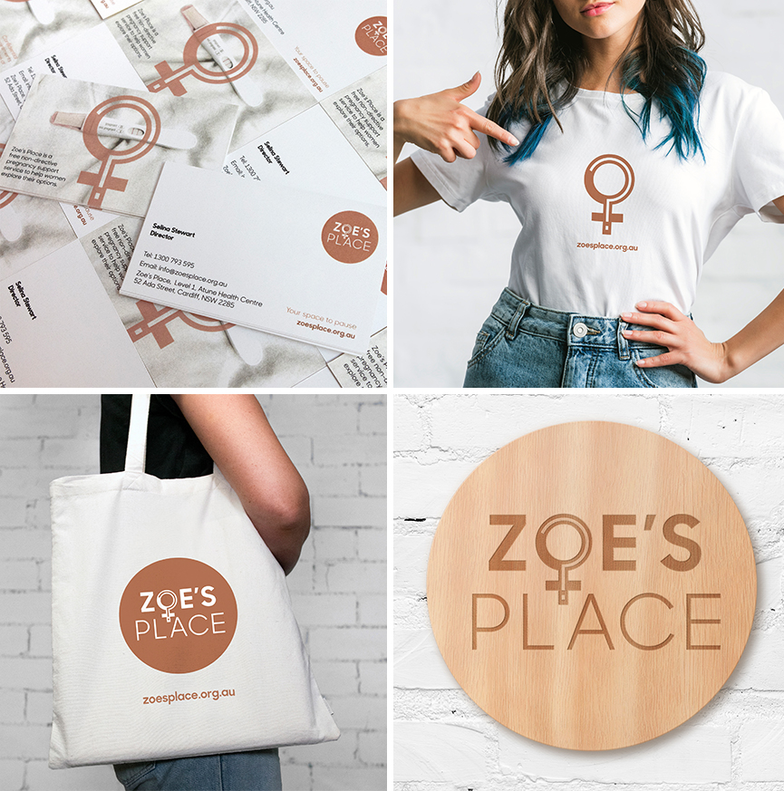
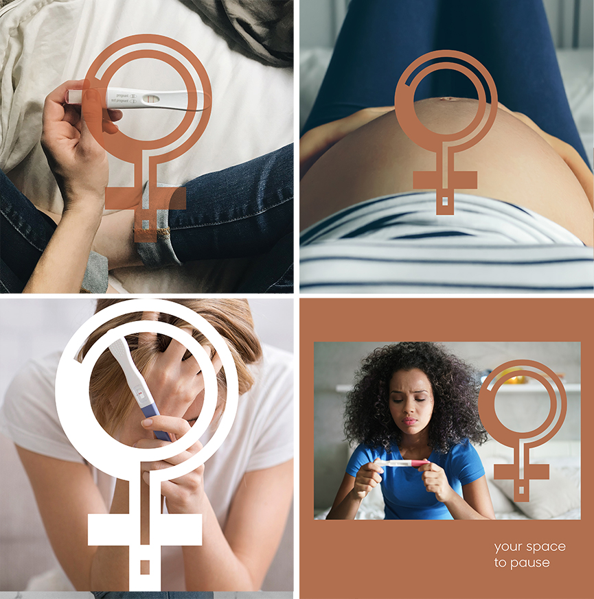
Zoe’s Place is a free, non-directive support service helping women to explore their options around unplanned or crisis pregnancies. Services include pregnancy testing, counselling, mentoring and post-abortion support. Founded in 2014, the service needed a new identity to better reflect the goal of empowering women to make autonomous decisions around their health in a safe space. With so many questions on women’s minds at this emotional time a question mark was the appropriate solution. The solution needed to be simple, easily recognizable and scale well across any media, especially digital.

Challenge: create an enduring, attractive and engaging brand identity for Zoe’s Place. The goal was for a simple, easily recognisable and trade markable symbol that would speak for itself in terms of what the service offered. Target audience: females 15-45.

With so many questions on women’s minds at this emotional time a question mark was the appropriate solution. The logo was able to be trade marked in Australia which was an important goal. The solution needed to be simple, easily recognizable and scale well across any media, especially digital. While the logo colour (bronze) is the core brand colour, variations of colour are planned after launch.

Check out Zoe’s Place website.
“We were so happy with the service Strategic Minds provided, rebranding our website, and redesigning our logo. With clear communication and attention to detail, throughout the whole design process they translated the organisation’s vision into a design that truly reflects who we are and what we do.” Selina Stewart, Executive Director, Zoe’s Place

